In a recent Google algorithm update, the search giant added user experience as one of the search engine ranking factors that help determine where a website shows up in the search engine results. To improve the user experience on your website, you need to make sure it is more accessible to every visitor.
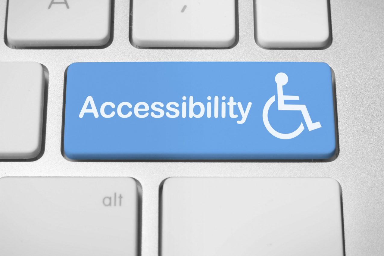
When it comes to your website, accessibility means that any visitor to your site can use it, regardless of their disabilities. This includes ensuring your colors are viewable by people with colorblindness, your pages are compatible with additive technology like screen readers for the visually impaired, that you have captions on your videos for the hearing impaired, and more.
If your site is not accessible to people with disabilities, you are excluding billions of people worldwide, and that means you are missing out on opportunities to make them customers. Here, we will look at some ways you can improve the accessibility of your website.
Headings
Adding headings to your website is a quick and easy way to help visitors and search engines understand the content of your pages. Using headings on your website makes it easier for assistive technology to create in-page navigation. Your readers who do not need assistive technology appreciate having headings because it makes it easier for them to skim to the information they are looking for.
Make sure your headings are descriptive and that you use them correctly. For example, the H1 heading should only be used for the title of the page. Then, H2 headings are used for the key points on the page. For your sub-points to a topic, use H3 and smaller headings, nesting them all correctly. Do not jump from an H2 heading straight to an H5 heading without putting H3 and H4 headings in between them. This is a simple thing to do that makes it a lot easier for someone with assistive technology to navigate your page.
Subtitles
For the hearing impaired — and people who like to watch videos with the volume off — add subtitles to all of your videos. If you have a podcast, add a transcript to the page that they can read instead. This is a small thing that does not take long to do, but it can make a big difference in the experience of someone who is hearing impaired. If there are no captions, they are going to be looking at other videos instead that do have them. There are a lot of different subtitle makers and transcript makers available today for you to choose from. If your videos are on YouTube or Facebook, both of these social networks offer automatic subtitle generators that are easy to use. Make sure you proofread them and that they match what is said in the video before you release them; subtitles full of errors can be frustrating for viewers.
Descriptive Links and Alt Text
Both of these are important to someone using a screen reader. A screen reader converts the content of your website, including your images and links, into braille or speech. If you are using a PC, you can use NVDA for free to test how your site holds up to a screen reader. For a Mac user, VoiceOver usually comes installed on the computer.
While listening to the content of your site as if it was being run through a screen reader may seem like a hassle, it helps you understand how someone using these tools will experience your page. You will be able to identify issues with the order things read in, how it registers images and links, and more.
If you do not use alt text on an image, it is not going to be described by the screen reader, so if an image is important, you should include alt text so everyone can access it. For link text, if you just have “read more,” “learn more,” or “click here,” that does not tell someone using a screen reader where the link is supposed to take them, so they are less likely to click on the link. This might seem like a small thing, but if you are relying on a screen reader, these are crucial to the user experience, and if they experience too many issues on your site, they will visit a different site that accommodates their needs.
As an added bonus, when using a screen reader simulator, you will also be able to pick up on any small grammatical errors or awkward phrasing because you will hear it out loud. You can proofread your site and make it more accessible at the same time.
Color Contrast
The color contrast is the difference between anything on the page, like your background color and font color. For example, if you have a white background for a page, then use a bright yellow font color, or a black background with a dark font color, that can be hard to read even for someone without visual impairments. Keep in mind that just because you see a good color contrast does not mean that everyone who visits your page will agree. Thankfully, there are some tools that can audit the color contrast of your website, which will rate your contrasts based on the Web Content Accessibility Guidelines; you want a minimum score of 4.5:1 to meet these guidelines. If you want to experience for yourself how someone with colorblindness sees your website, there is a color blindness simulator on the Color Contrast Analyser. This can be helpful to truly show you the importance of color contrasts and put yourself in someone else’s shoes.
Final Thoughts
While there are many things to do to improve accessibility on your website, you do not have to do them all in one go. However, it is important to think of accessibility as a key component to your website and not an extra to add on later when you have time. Once you have made your site more accessible, it is easy to maintain as you publish new content.


Leave A Comment